Table of Contents
In today’s world, data is everywhere. From businesses to governments, the need to understand and interpret massive amounts of information is crucial. One of the best ways to make sense of data is through visualization—using charts, graphs, and other visuals to show patterns, trends, and insights.
When it comes to creating powerful, interactive visualizations, which stands for Data-Driven Documents, is a powerful JavaScript library that helps you bring data to life through interactive visualizations.
In this blog post, we’ll explore what D3.js is, why it’s useful, and how you can start using it to create your own stunning data visualizations.
What is D3.js?
D3.js is a JavaScript library created by Mike Bostock. It was first released in 2011 and has since become one of the most popular tools for creating data visualizations on the web. Unlike many other visualization libraries that provide pre-built chart types, D3.js gives developers control over every aspect of the visualization. This flexibility allows you to create completely custom visuals.
D3.js works by taking data and binding it to the DOM (Document Object Model). This allows you to use HTML, SVG (Scalable Vector Graphics), and CSS to display your data in any way you like. It is not limited to charts—it can be used for anything from simple bar charts to complex geographic maps.
It pairs beautifully with modern JavaScript frameworks like Angular, Vue, and Svelte, as well as React (which, unlike Angular, is a library and not a full-fledged framework) know more, allowing developers to create highly interactive and data-driven visualizations while leveraging the powerful state management and reactivity these technologies provide.
Why Use D3.js?
Flexibility: It offers full control over how your data is visualized. Unlike other libraries, you’re not limited to a set of pre-designed charts or graphs.
Interactivity: One of the standout features of It is its ability to create interactive visualizations. You can create visuals that respond to user input, allowing viewers to explore the data in a meaningful way.
Customization: With D3.js, you can create completely custom visuals that match your specific needs. Whether you need a simple line chart or a complex, animated map, It makes it possible.
Works with Web Standards: D3.js uses open web standards like HTML, SVG, and CSS, making it highly compatible with modern web development.
Large Community: D3.js has a large and active community, which means plenty of tutorials, examples, and support are available if you get stuck.
Getting Started with D3.js
Before we jump into coding, let’s make sure you have the basic tools set up to start working with D3.js. You’ll need:
A basic understanding of JavaScript, HTML, and CSS. D3.js is built on JavaScript, so knowing the basics will help you.
A text editor (like VSCode, Sublime, or Notepad++) to write your code.
A browser (like Chrome or Firefox) to view your visualizations.
Step-by-Step Guide to Creating a Bar Chart with D3.js
In this section, we will walk through the important D3.js parts of the code to create a basic bar chart. The chart will have axes, interactivity (hover effects), and labels for better visualization.
1. Setting up the SVG Container
We need to define the area where our chart will be displayed. This is done using D3’s select() and append() methods to create an SVG element.
const margin = { top: 20, right: 30, bottom: 40, left: 40 },
      width = 500 - margin.left - margin.right,
      height = 300 - margin.top - margin.bottom;

const svg = d3.select("body")
  .append("svg")
  .attr("width", width + margin.left + margin.right)
  .attr("height", height + margin.top + margin.bottom)
  .append("g")
  .attr("transform", `translate(${margin.left},${margin.top})`);
Explanation:
An SVG container is appended to the body and a g (group) element is appended within it. This g element is shifted using the transform property to respect the margins. It helps to avoid overlap with the axes.
We first set margins to create space for axes and labels.
The width and height are calculated based on the margins.
2. Creating Scales
Scales are an essential part of D3.js to map data values to the visual dimensions (such as the height of the bars or positioning on the x-axis).
Y-Axis Scale (Height of Bars)
const yScale = d3.scaleLinear()
  .domain([0, d3.max(data)])  // Set domain from 0 to the max value in data
  .range([height, 0]);        // Map data to the height of the chart
X-Axis Scale (Position of Bars)
const xScale = d3.scaleBand()
  .domain(d3.range(data.length))  // Map each bar index to a point on the x-axis
  .range([0, width])              // Set the range from 0 to the full width of the SVG
.padding(0.1); // Add padding between barsExplanation:
- yScale is a linear scale, meaning it maps a range of input values (data values) to an output range (height of the SVG). In this case,
d3.max(data)gives the highest value in the dataset, and the range is inverted to make sure higher values are at the top. - xScale is a band scale, used to position the bars along the x-axis. It evenly spaces the bars and includes padding between them.
3. Adding Axes
Axes in D3.js are generated using d3.axisLeft for the y-axis and d3.axisBottom for the x-axis.
Y-Axis
svg.append("g")
  .call(d3.axisLeft(yScale));
X-Axis
svg.append("g")
  .attr("transform", `translate(0,${height})`)  // Move the x-axis to the bottom
.call(d3.axisBottom(xScale).tickFormat(i => `Bar ${i + 1}`)); // Format the ticksExplanation:
- The
call()function adds the axes to the SVG container. - The y-axis is positioned automatically, while the x-axis needs to be shifted down using the
transformproperty. tickFormat()is used to customize the labels of the x-axis ticks, labeling each bar asBar 1,Bar 2, etc.
4. Drawing the Bars
This is where D3.js shines in terms of its data-binding capabilities. We bind the data to rect elements and position them based on the scales.
svg.selectAll(".bar")
  .data(data)
  .enter()
  .append("rect")
  .attr("class", "bar")
  .attr("x", (d, i) => xScale(i))      // Set x position for each bar
  .attr("y", d => yScale(d))           // Set y position (based on the data)
  .attr("width", xScale.bandwidth())   // Set the width of the bar
  .attr("height", d => height - yScale(d))  // Set height based on data
.attr("fill", "steelblue");Explanation:
selectAll(".bar"): Select all bars (though none exist yet).data(data): Binds the data array to these futurerectelements.enter(): Enters the bound data (for each item in the dataset).append("rect"): Appends arectfor each data point.attr(): Sets attributes like position (xandy), width, height, and color (fill).
5. Adding Interactivity (Hover Effect)
You can make your chart interactive by adding simple hover effects. D3.js provides an easy way to respond to mouse events.
.on("mouseover", function () {
    d3.select(this).attr("fill", "orange");  // Change color on hover
})
.on("mouseout", function () {
    d3.select(this).attr("fill", "steelblue");  // Revert color on mouseout
});
Explanation:
mouseover: When the user hovers over a bar, it changes the color to orange.mouseout: When the mouse moves away from the bar, the color returns to steelblue.
6. Adding Labels to Bars
To display the data values inside the bars, you can use text elements and position them dynamically.
svg.selectAll(".bar-label")
  .data(data)
  .enter()
  .append("text")
  .attr("class", "bar-label")
  .attr("x", (d, i) => xScale(i) + xScale.bandwidth() / 2)  // Position in the center of each bar
  .attr("y", d => yScale(d) + 20)                          // Position above the bottom of the bar
  .text(d => d);                                           // Display the data value
Explanation:
- This code selects all potential text labels and binds data to them.
- The labels are positioned in the middle of the bars (
xposition) and slightly above the bottom of each bar (yposition). text(d => d): Sets the text to the data value.
Full Code
<!DOCTYPE html>
<html lang="en">
<head>
<meta charset="UTF-8">
<meta name="viewport" content="width=device-width, initial-scale=1.0">
<title>Simple D3.js Bar Chart</title>
<script src="https://d3js.org/d3.v7.min.js"></script>
<style>
/* Styling for the SVG container */
svg {
background-color: #f9f9f9;
margin: 40px;
}
/* Styling for the axis text */
.axis text {
font-family: sans-serif;
font-size: 12px;
}
/* Styling for the bar labels */
.bar-label {
font-family: sans-serif;
font-size: 14px;
fill: white;
text-anchor: middle;
}
</style>
</head>
<body>
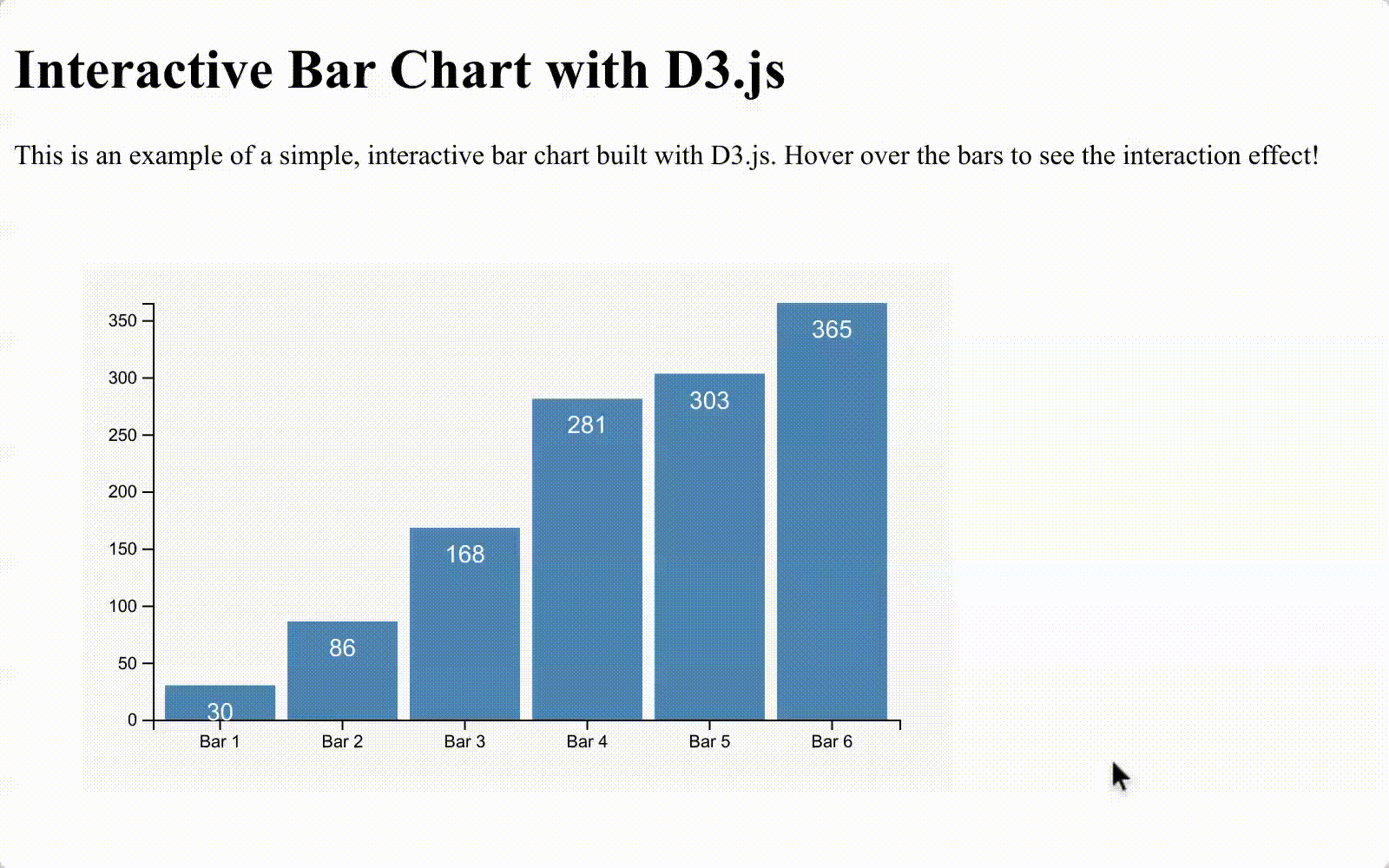
<h1>Interactive Bar Chart with D3.js</h1>
<p>This is an example of a simple, interactive bar chart built with D3.js. Hover over the bars to see the interaction
effect!</p>
<script>
// Sample data
const data = [30, 86, 168, 281, 303, 365];
// Set dimensions for the SVG container
const margin = { top: 20, right: 30, bottom: 40, left: 40 },
width = 500 - margin.left - margin.right,
height = 300 - margin.top - margin.bottom;
// Create an SVG container and translate it to account for margins
const svg = d3.select("body")
.append("svg")
.attr("width", width + margin.left + margin.right)
.attr("height", height + margin.top + margin.bottom)
.append("g")
.attr("transform", `translate(${margin.left},${margin.top})`);
// Create a linear scale for the y-axis (height of bars)
const yScale = d3.scaleLinear()
.domain([0, d3.max(data)])
.range([height, 0]);
// Create a band scale for the x-axis (width of bars)
const xScale = d3.scaleBand()
.domain(d3.range(data.length))
.range([0, width])
.padding(0.1);
// Add y-axis to the chart
svg.append("g")
.call(d3.axisLeft(yScale));
// Add x-axis to the chart
svg.append("g")
.attr("transform", `translate(0,${height})`)
.call(d3.axisBottom(xScale).tickFormat(i => `Bar ${i + 1}`));
// Create bars for the chart
svg.selectAll(".bar")
.data(data)
.enter()
.append("rect")
.attr("class", "bar")
.attr("x", (d, i) => xScale(i))
.attr("y", d => yScale(d))
.attr("width", xScale.bandwidth())
.attr("height", d => height - yScale(d))
.attr("fill", "steelblue")
.on("mouseover", function () {
d3.select(this).attr("fill", "orange");
})
.on("mouseout", function () {
d3.select(this).attr("fill", "steelblue");
});
// Add labels to the bars
svg.selectAll(".bar-label")
.data(data)
.enter()
.append("text")
.attr("class", "bar-label")
.attr("x", (d, i) => xScale(i) + xScale.bandwidth() / 2)
.attr("y", d => yScale(d) + 20)
.text(d => d);
</script>
</body>
</html>Output
Conclusion
D3.js is a powerful tool for creating interactive and customizable data visualizations. Its flexibility allows developers to go beyond basic charts, making it ideal for crafting visuals that tell a data-driven story. While D3.js has a learning curve, its level of control is unmatched among data visualization libraries.
If you’re new to D3.js, start with simple charts like the bar chart in this tutorial. As you get more comfortable, explore features like animations, transitions, and interactivity. With practice, you’ll be able to create stunning visuals that reveal the insights in your data.
For more details, check out the official D3.js documentation.
Happy coding!